MyPopcorn
Overview
CLIENT: SMARTFOODS
DATE: 2021

ART DIRECTOR: PETER KASDAGLIS
PHOTOGRAPHY: LEFTY KASDAGLIS

BRANDING
WEBSITES
PHOTOGRAPHY

Make it Pop.


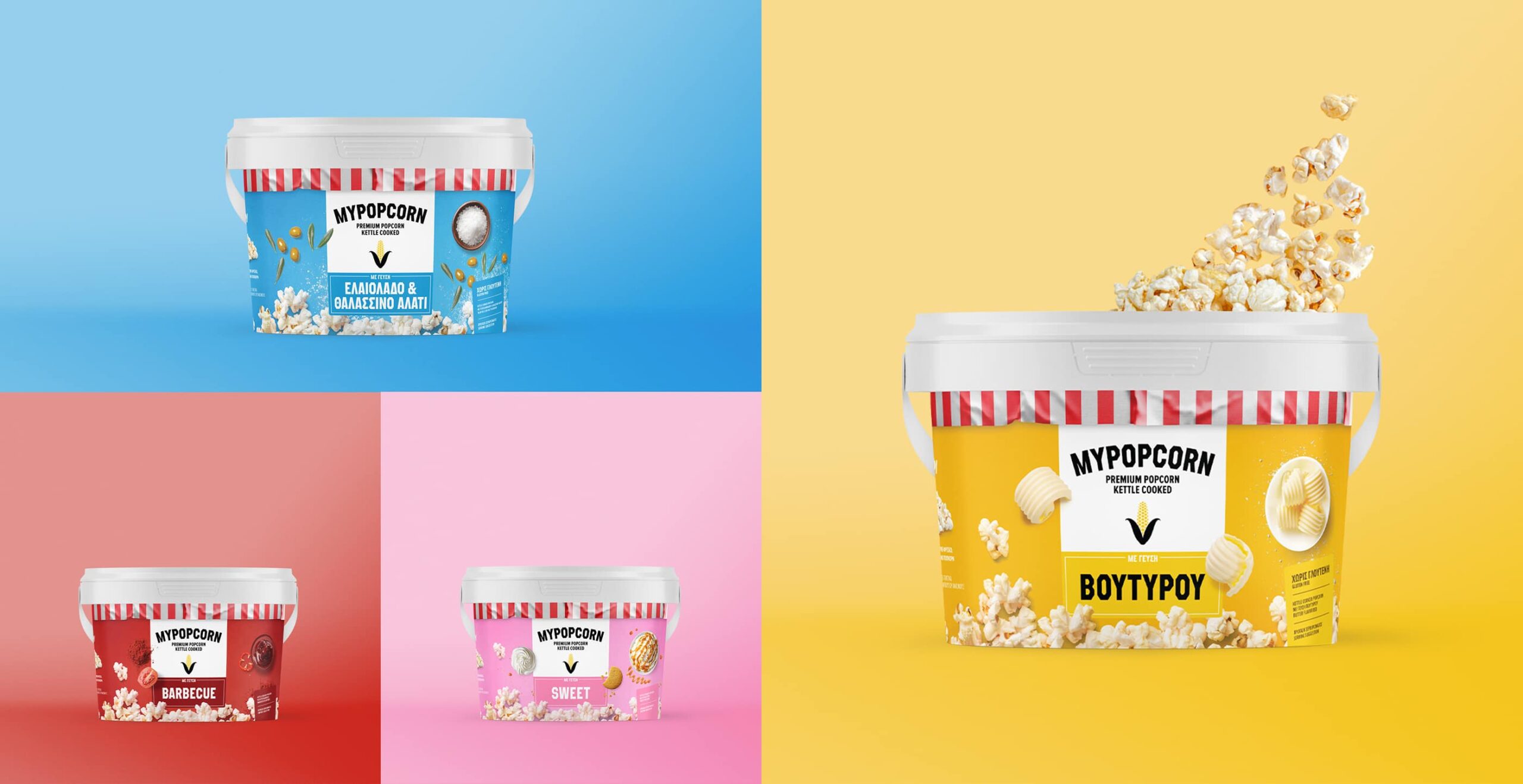
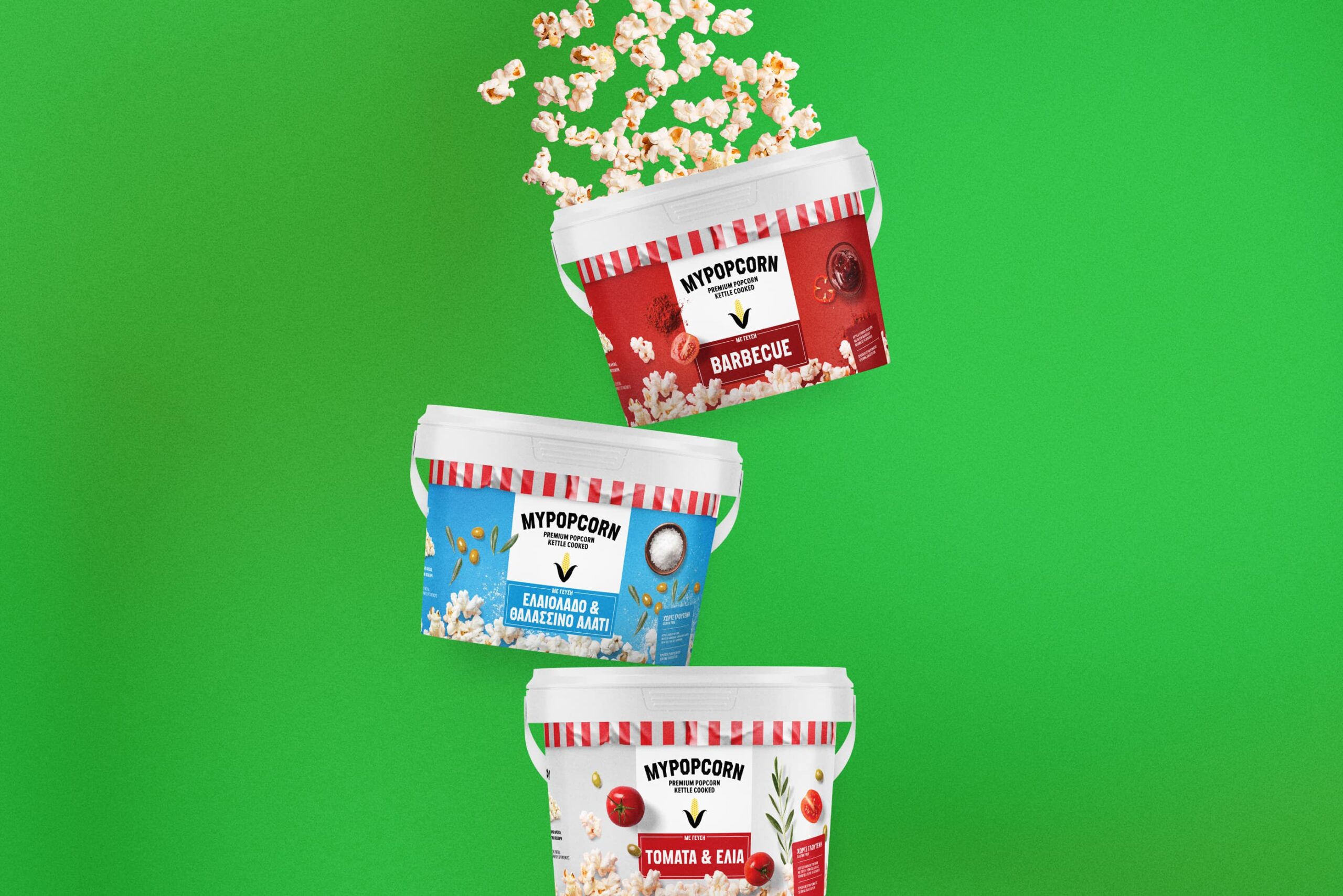
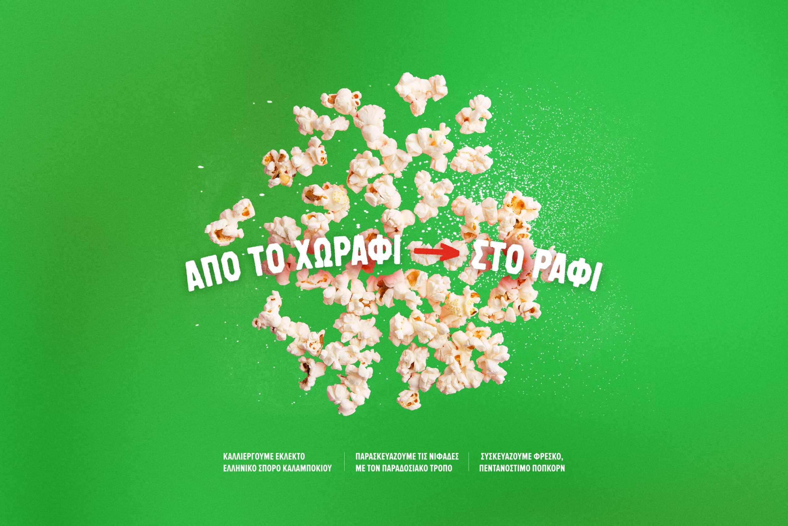
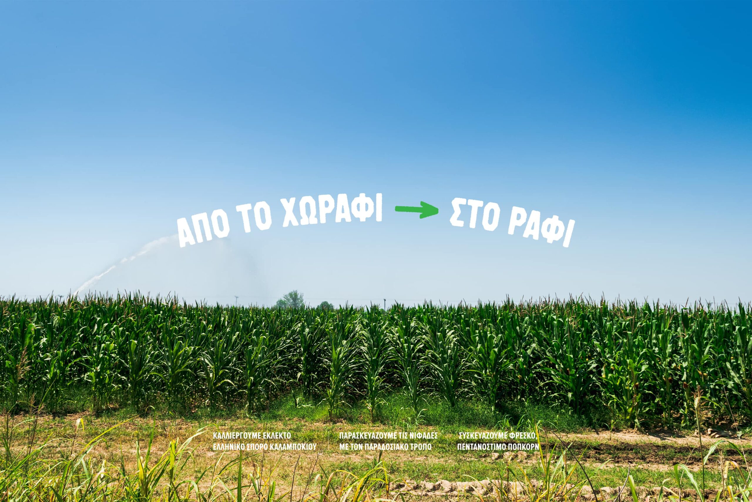
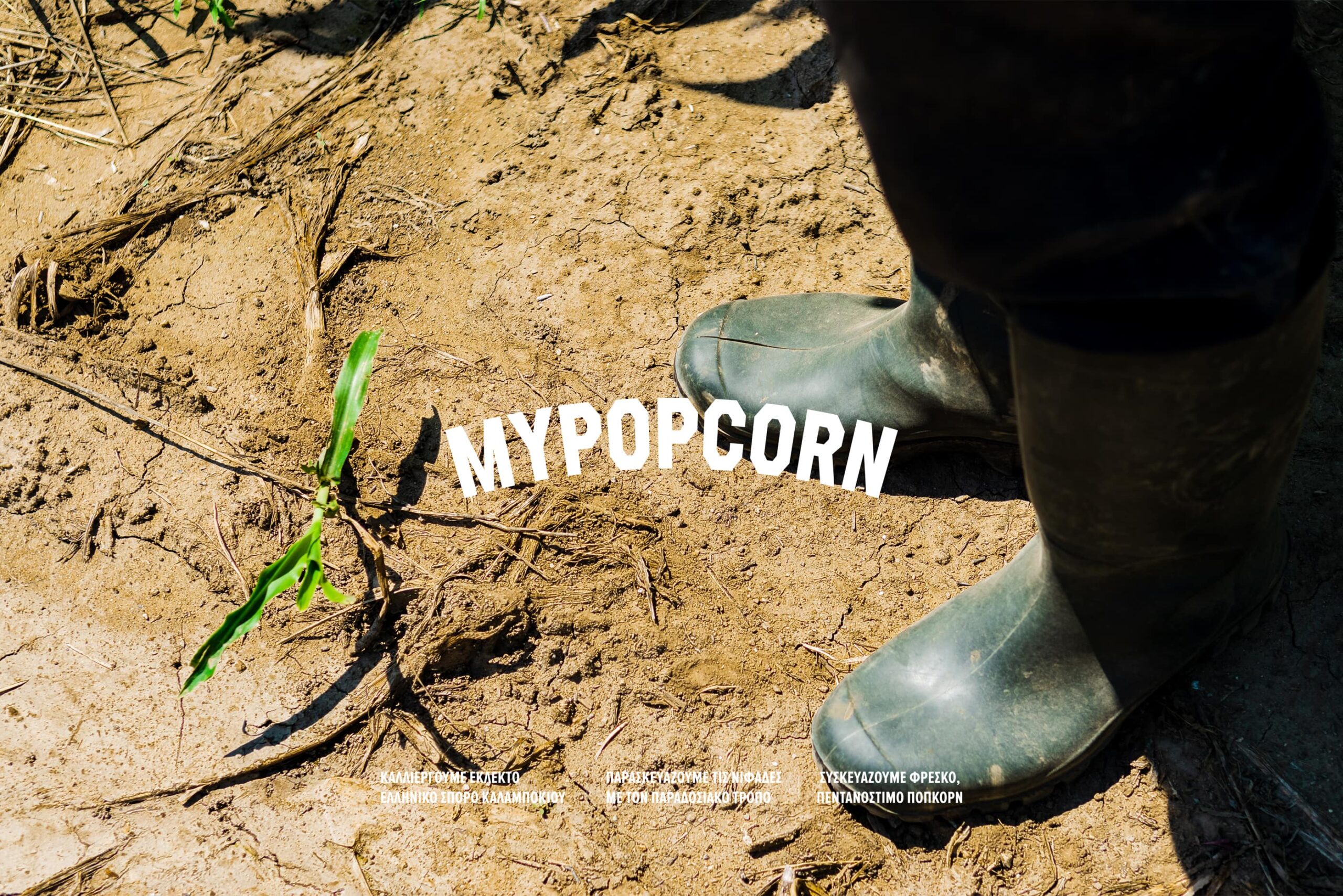
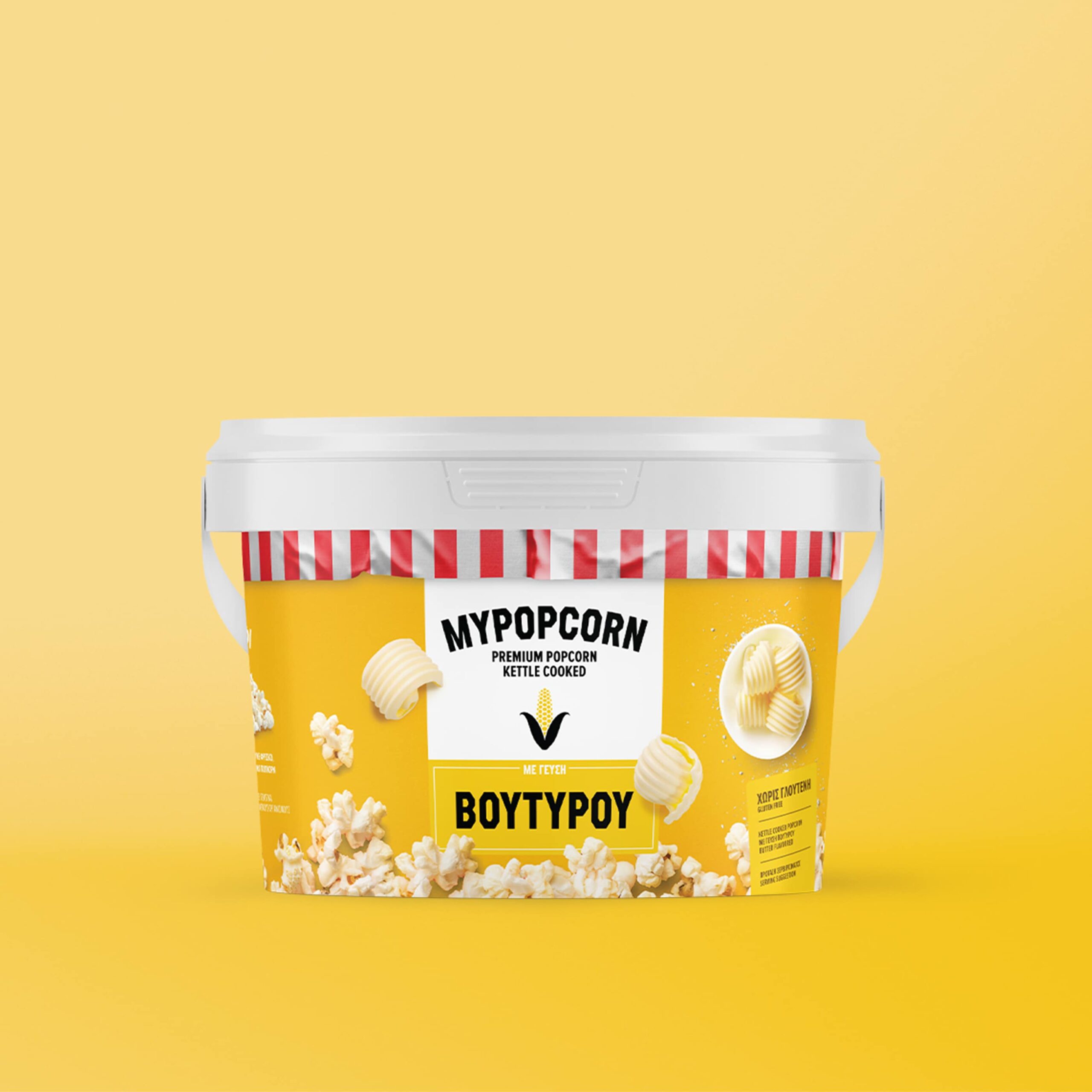
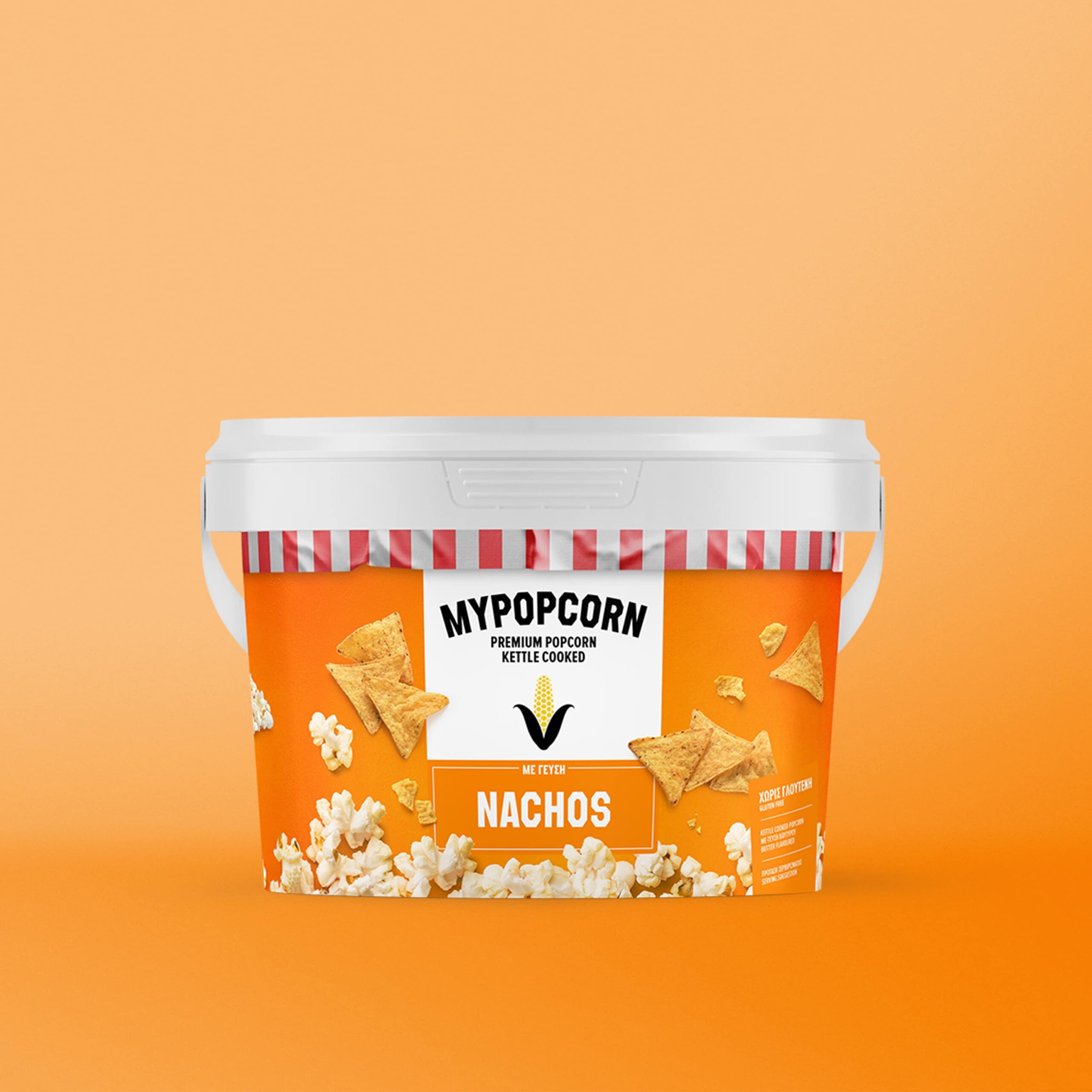
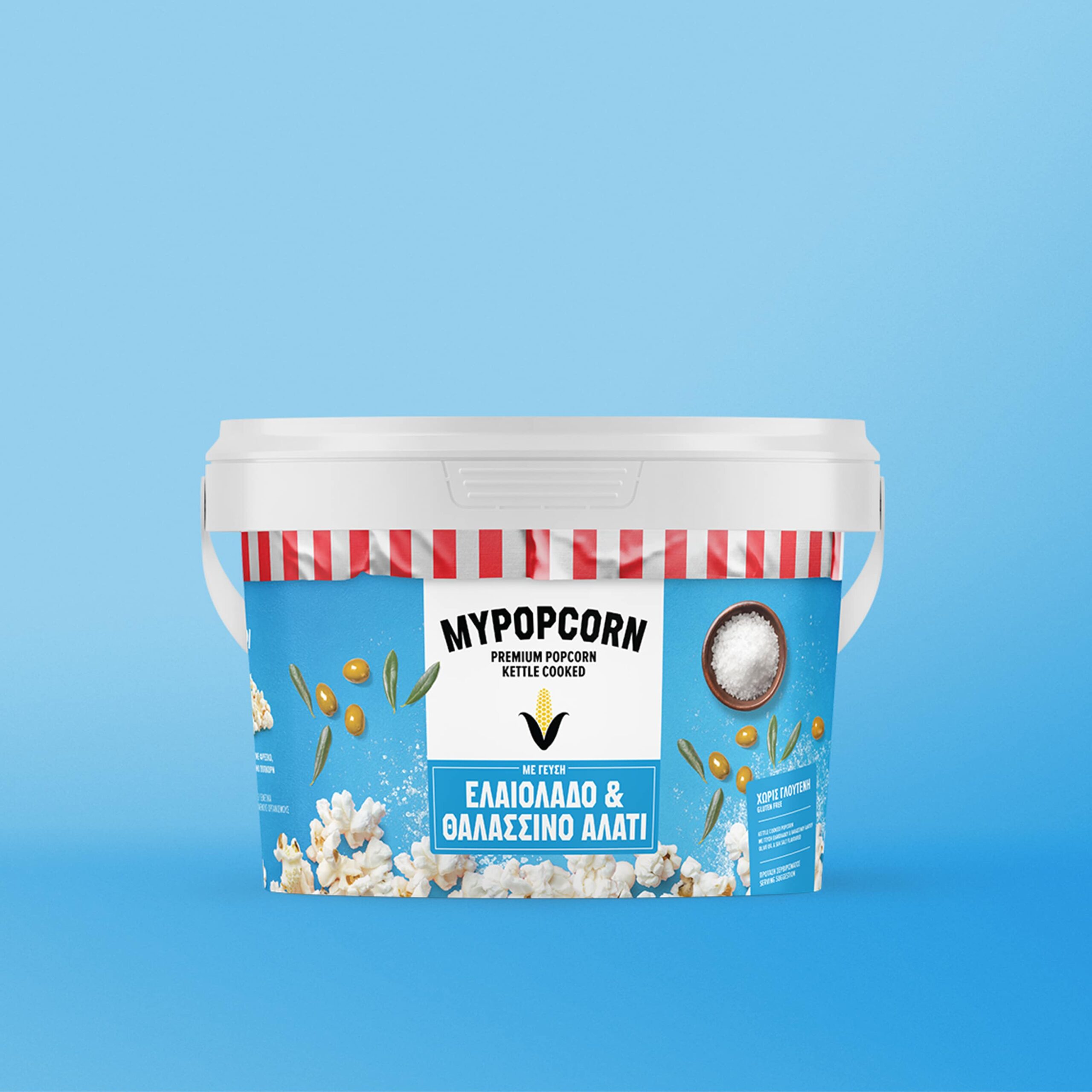
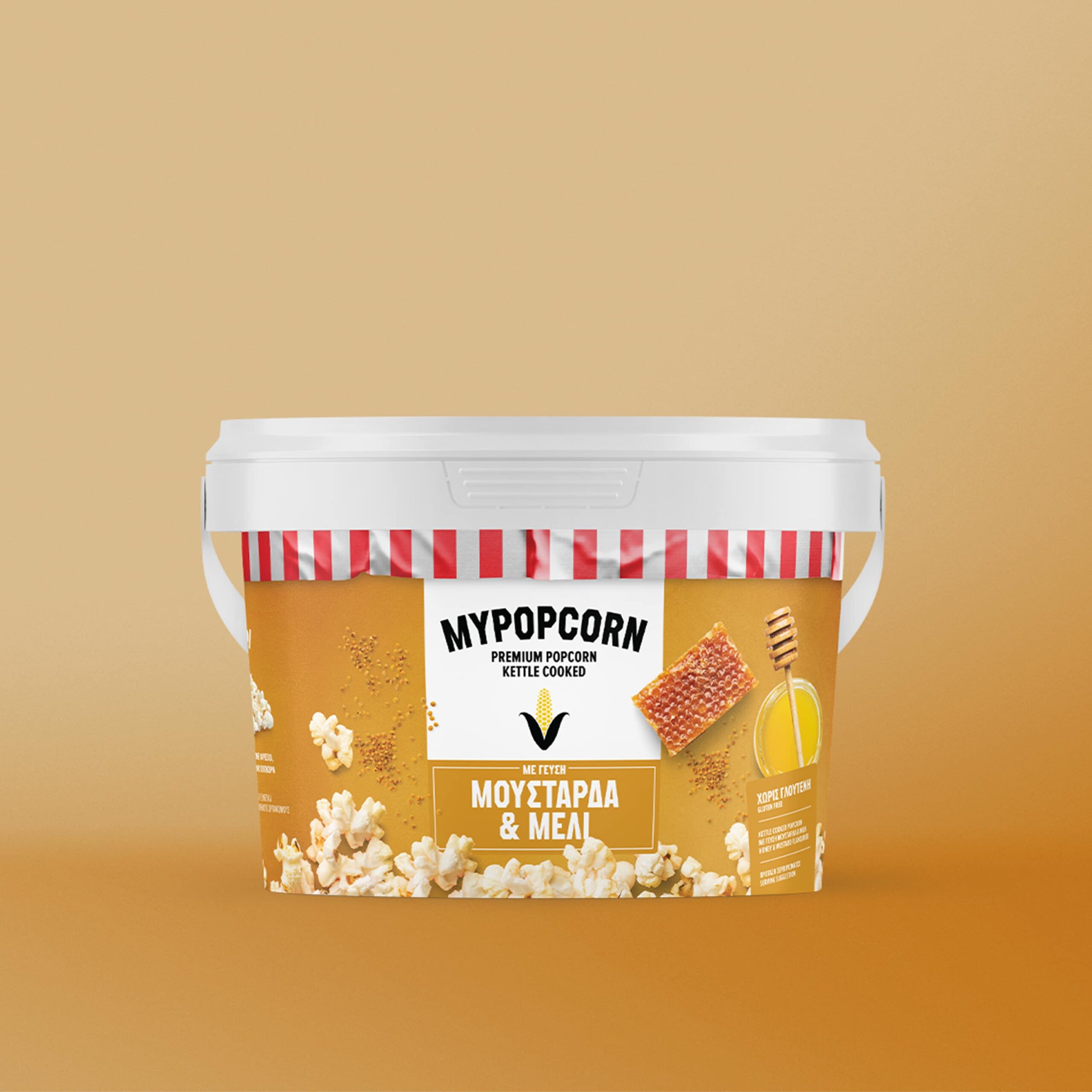
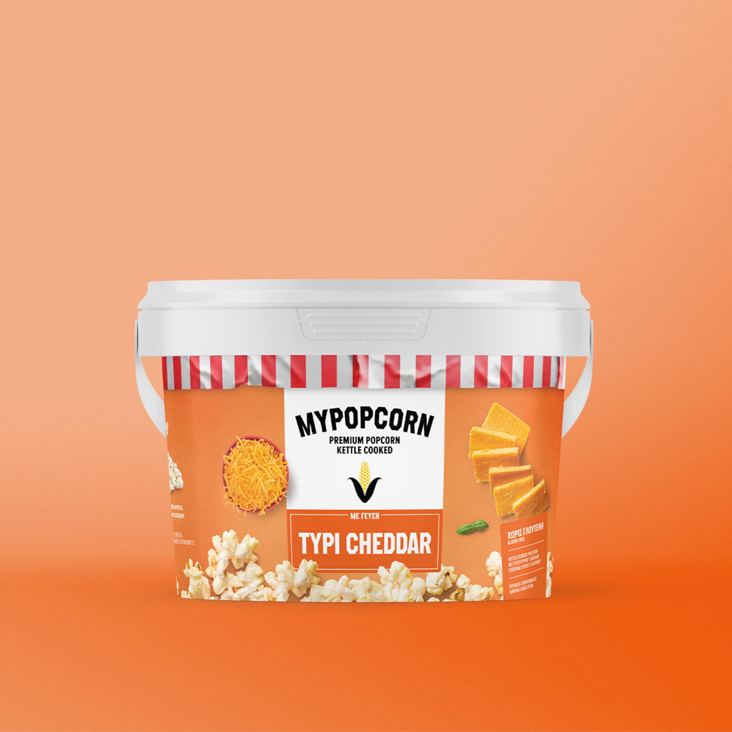
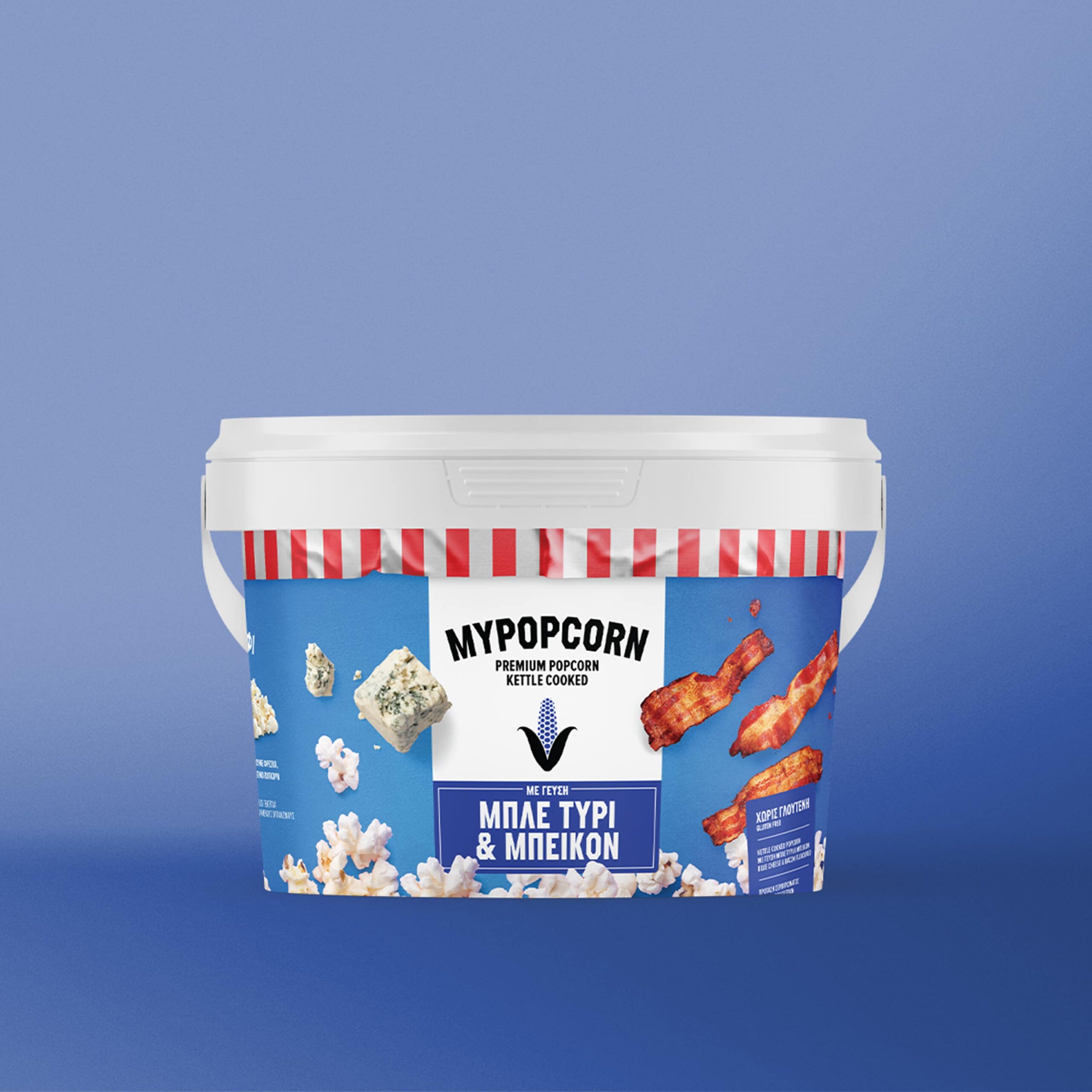
With more than 40 years of experience and know-how in the food sector, especially in the production of vegetable raw material (maize) SmartFoods is a pioneer in the production of popcorn products. Made from 100% Greek corn seed grown on the company's own farms, the excellent quality of the corn is the result of the company's commitment to quality.

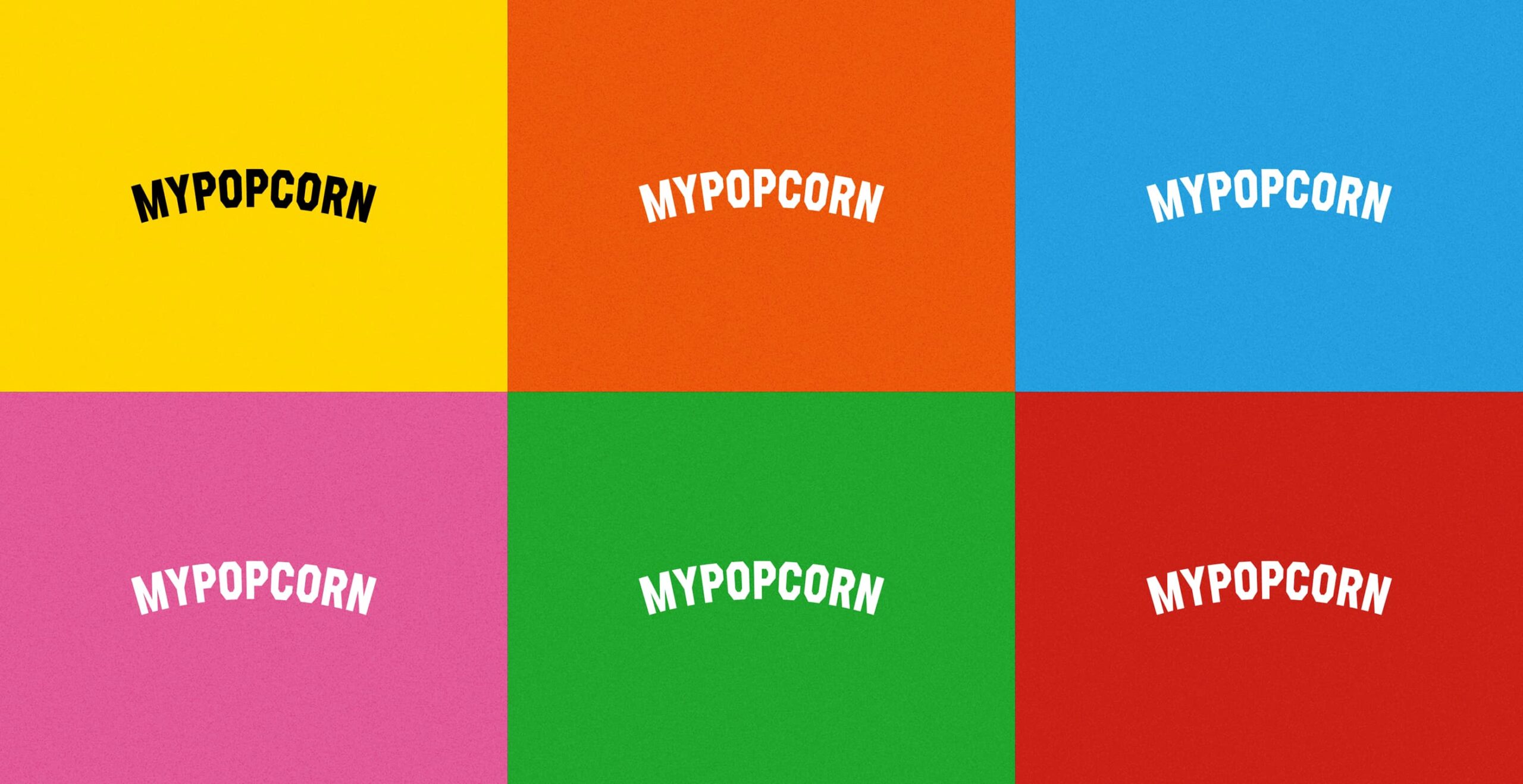
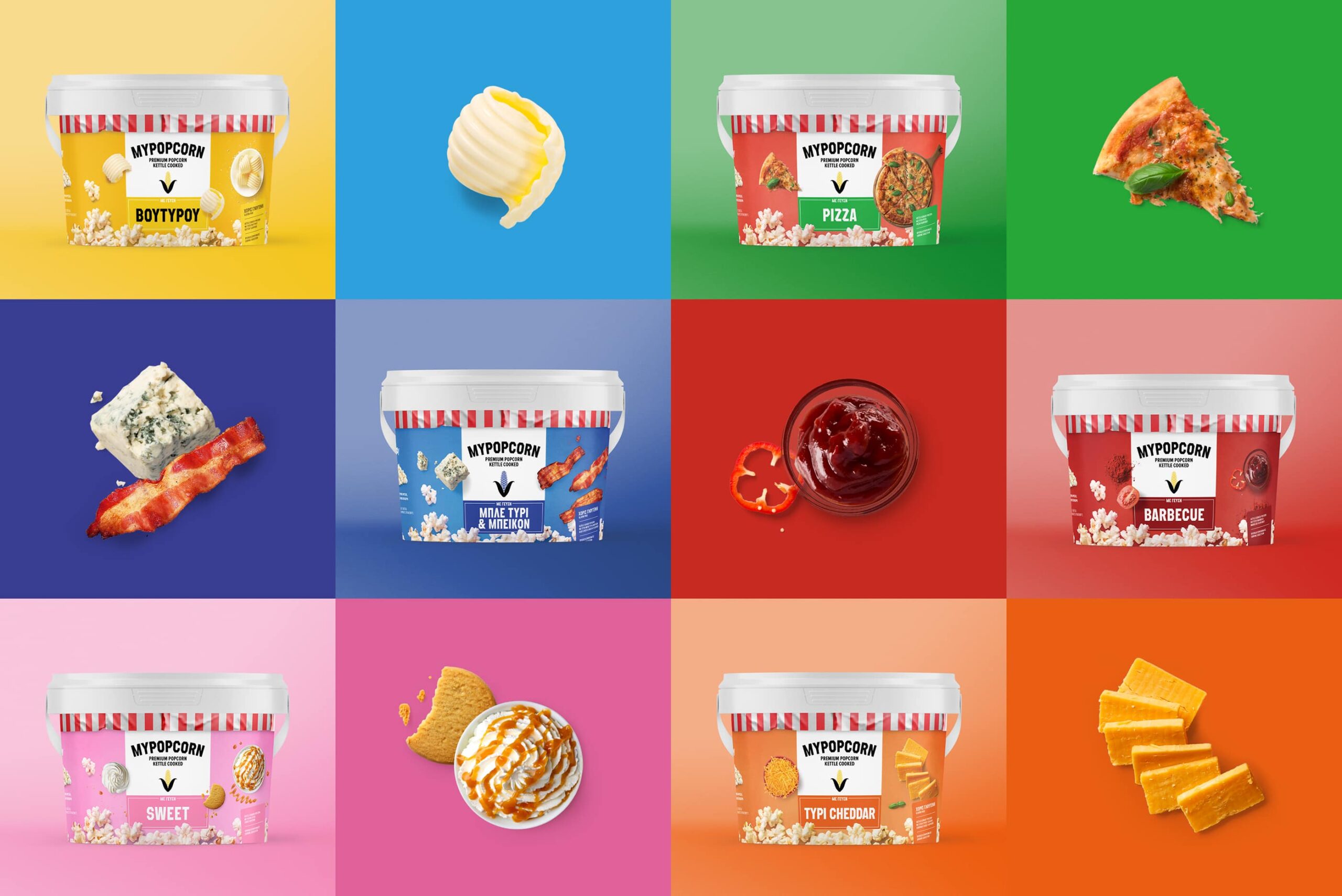
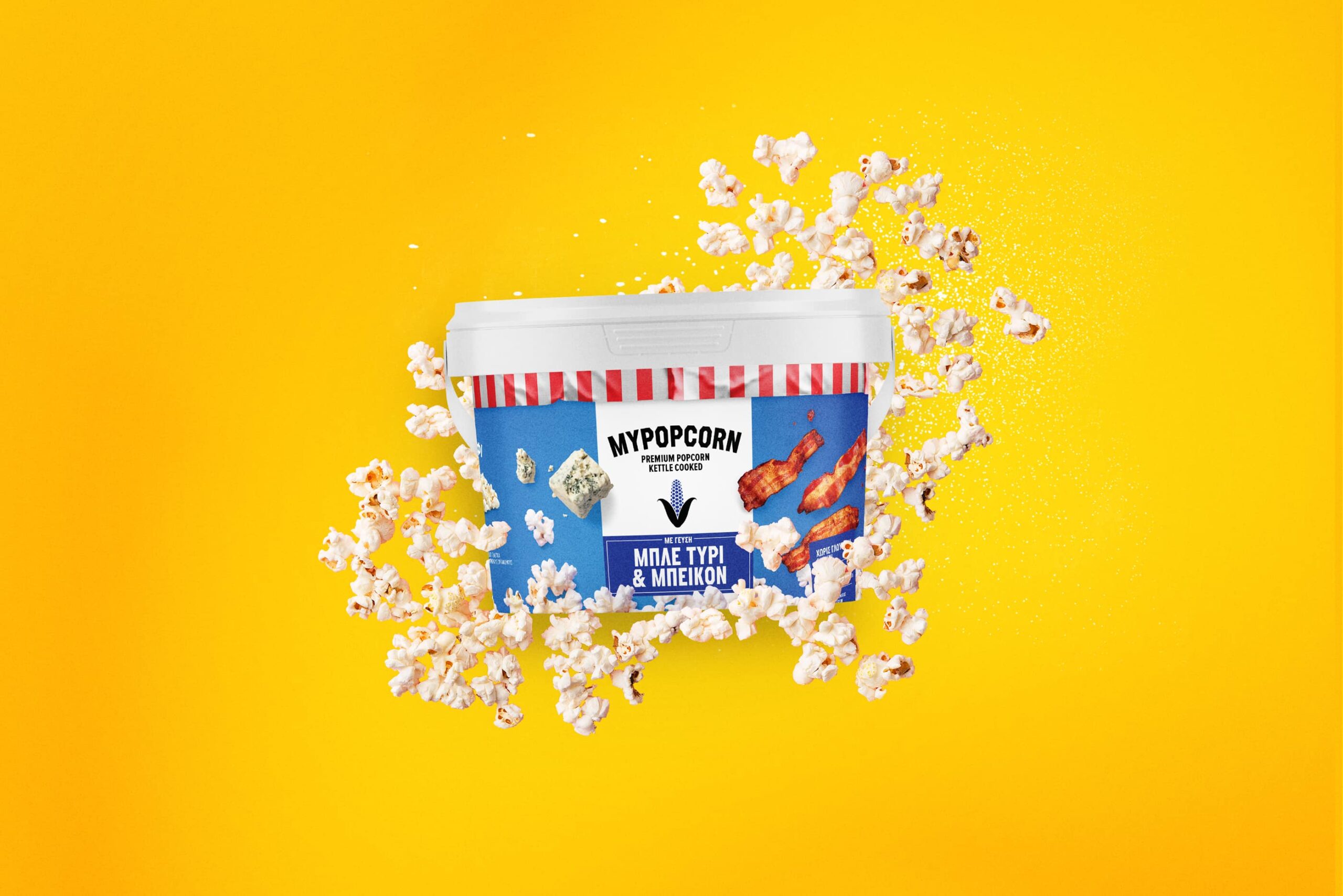
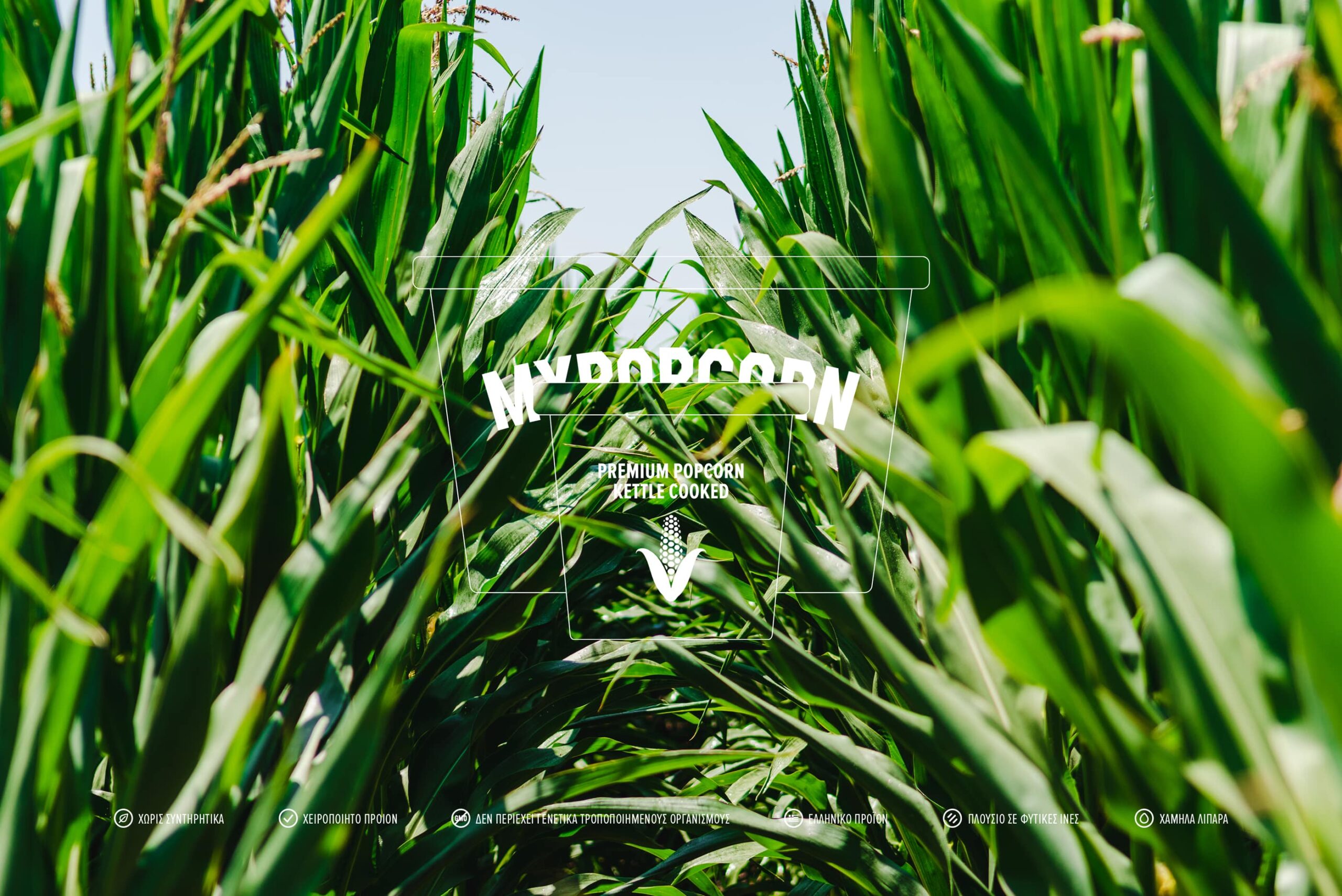
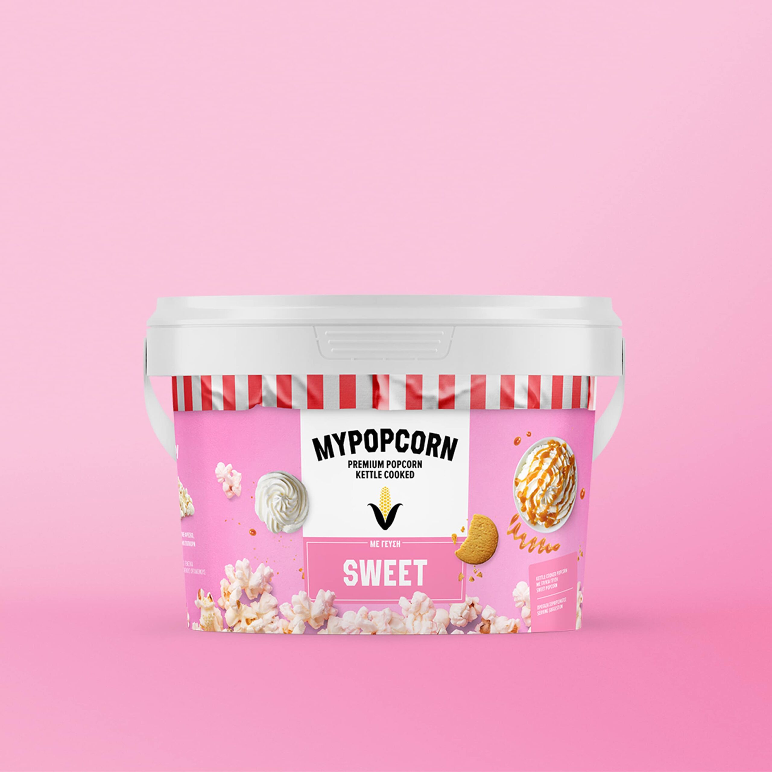
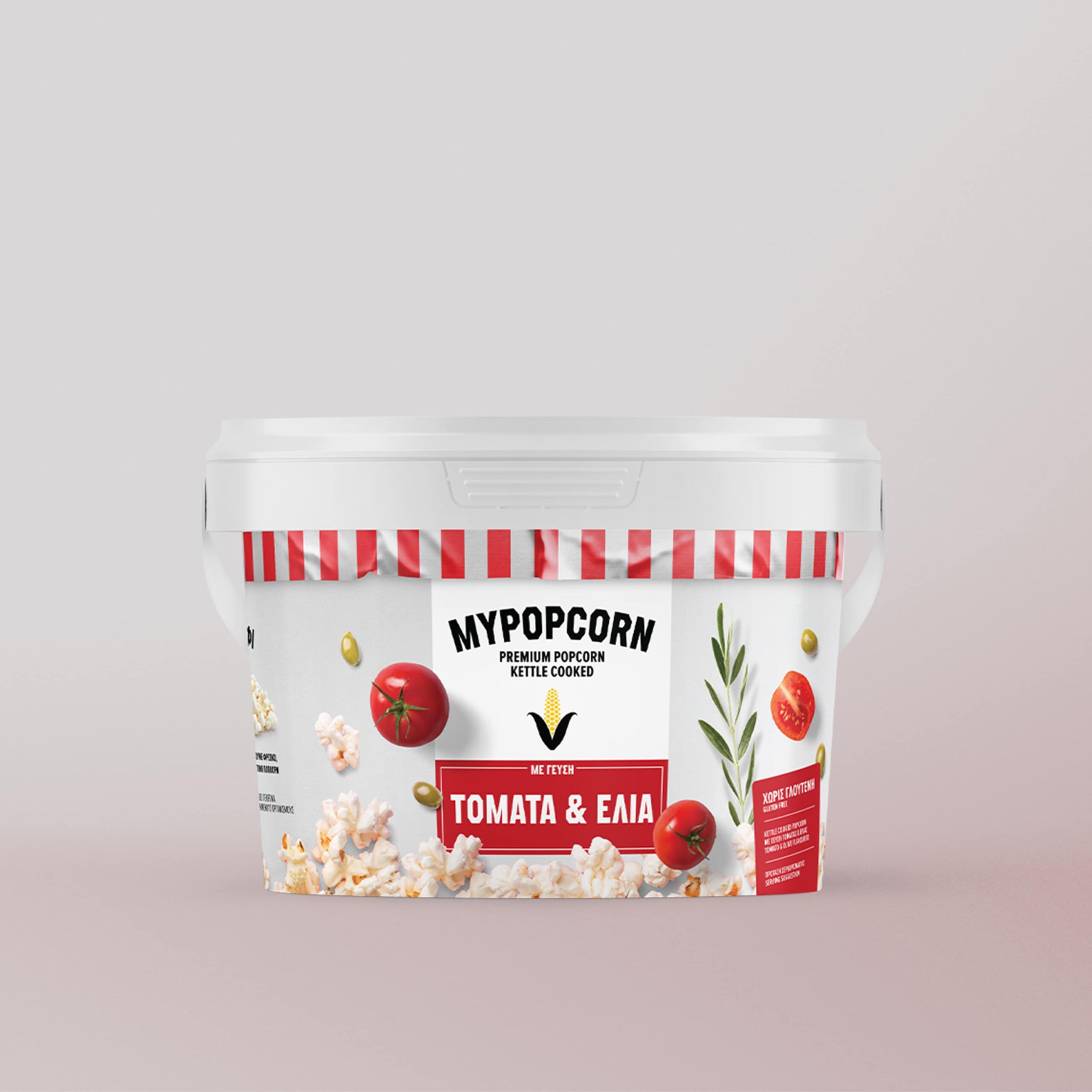
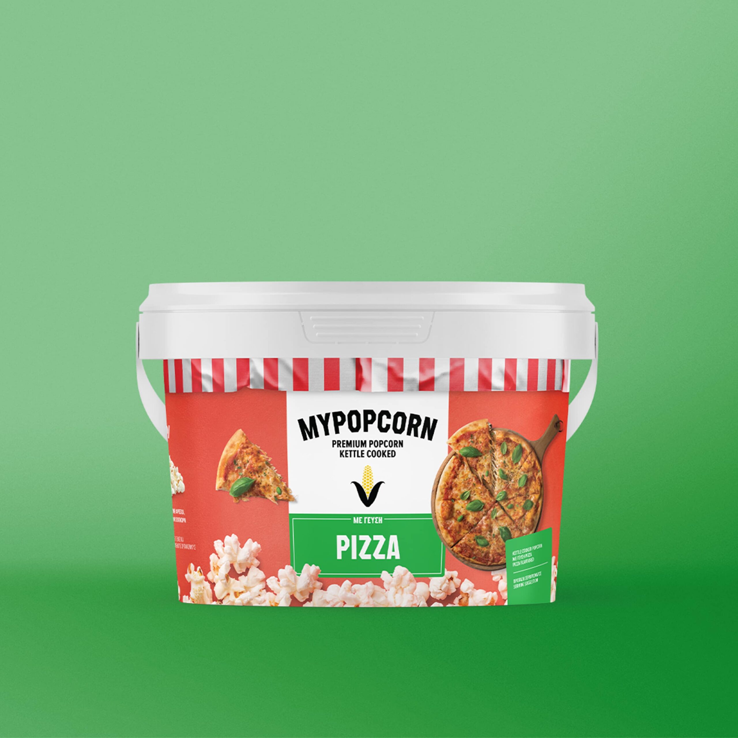
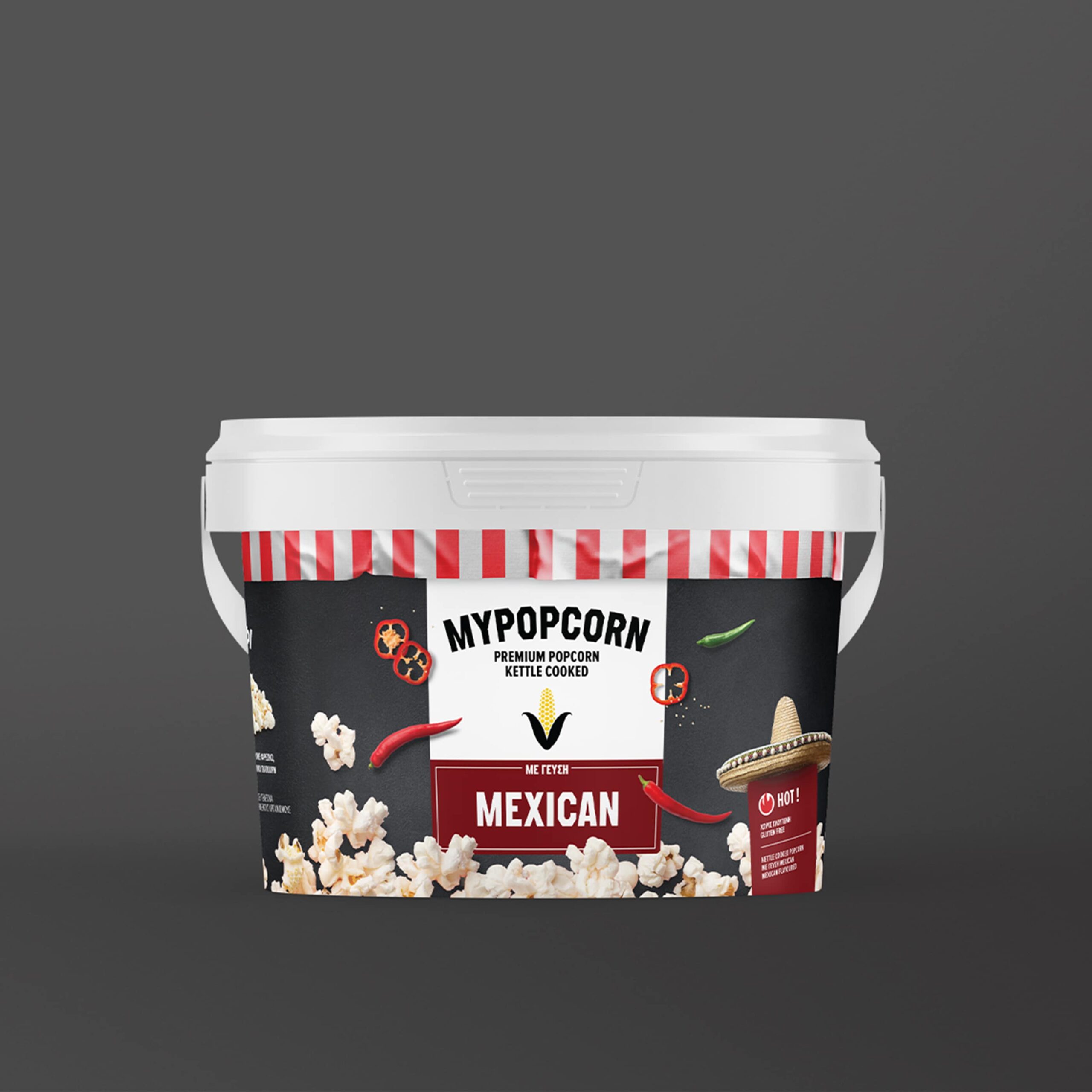
In a dynamic food market defined by rapid evolution and intense competition, the MYPOPCORN brand underwent a strategic transformation to resonate with the discerning modern consumer. Our goal was not just a redesign but the establishment of MYPOPCORN as a memorable presence in the minds of our audience.

At the heart of this rejuvenation was a fresh perspective on the MYPOPCORN brand.

Fun, playful & inviting

Central to the rebranded packaging is the vibrant new logo, symbolizing a contemporary identity. Our typographic exploration embraced modern, geometric, and bold fonts, injecting a playful and youthful spirit while ensuring effective communication of key information.

A STORY OF DELICIOUS POPCORN

Deeply rooted in the essence of the brand, our packaging features enticing, top-down imagery of raw materials, inviting consumers into the journey "FROM THE FIELD TO THE SHELF." Positioned strategically, a visual-verbal interplay engages consumers, offering a tantalizing preview of the exceptional, natural experience that awaits them.

BOLD, GREEK & ALL NATURAL

This synthesis of design, information, and authenticity is poised to redefine the MYPOPCORN experience, capturing the essence of SmartFoods' commitment to quality and culinary innovation.
Next Project
Honorapharma